3 min read

Built to Be Walked Through: Planning Traffic Flow for 10x20 and 20x20 Trade Show Booths

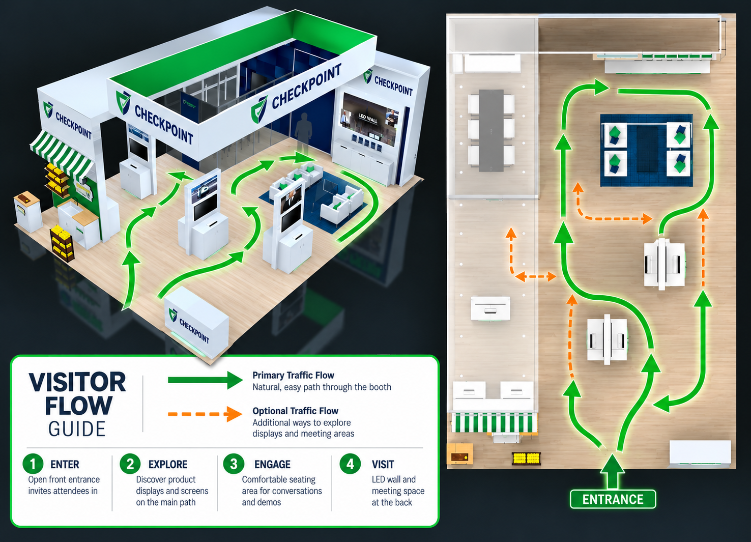
booth traffic flow

Most exhibitors judge a booth by how it looks in the rendering. Attendees judge it by how it feels to walk into. If they can't tell where to step in, who to talk to, or how to get back out, they skip it, no matter how good the graphics are.

Good traffic flow is what turns passing foot traffic into real conversations. It decides whether your staff spends the show talking to qualified buyers or watching people drift past. And on a 10x20 or 20x20 footprint, where every square foot counts, the layout has to earn its keep from the first sketch. Here's how to plan a booth that people move through easily, and why it pays off on the show floor.

Pass the Three-Second Test

Attendees decide from the aisle, usually mid-stride. They're carrying bags, checking their phones, and scanning dozens of booths at once. In about three seconds, your booth should tell them what you do, that they're welcome to come in, and who to approach.

If any of that takes effort to figure out, they keep walking. That's why traffic planning really starts outside the booth. Think about the main aisle, which way crowds will be coming from, and what a person sees first as they approach.exhibit traffic flow

10x20 Inline Booths: Let the Front Breathe

An inline booth has one open side, so that edge does all the inviting. Keep it as clear as you can.

  • Push the back wall graphics to do the storytelling, and keep the front edge low and open.
  • Avoid running a counter across the full width. It reads like a checkpoint.
  • If you need a counter, set it to one side or angle it so there's an obvious walkway past it.
  • Place your strongest visual, like a demo screen or hero product, deep enough that people have to step in to engage with it.

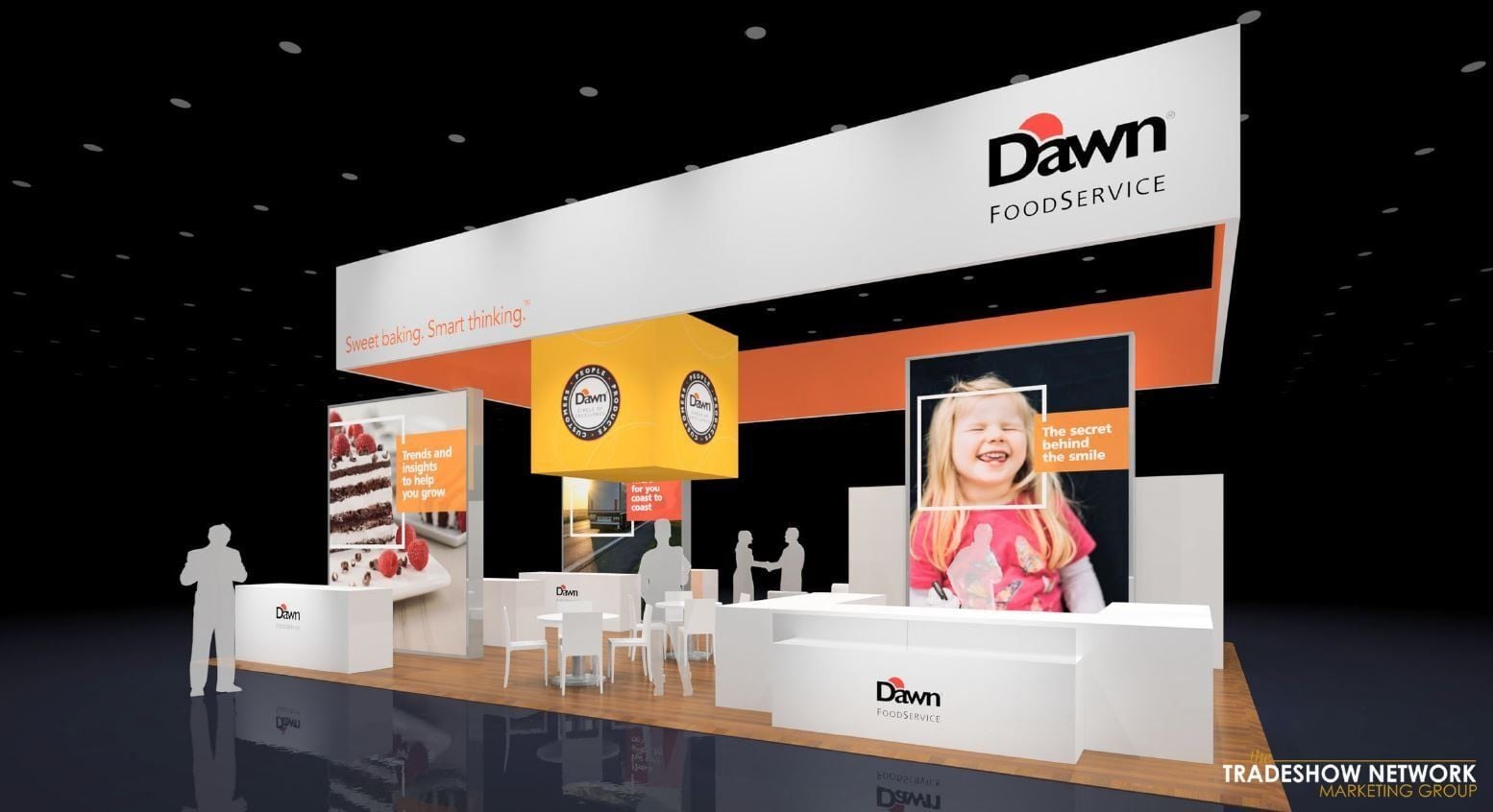
20x20 Island Booths: Every Side Is a Front Door

An island is open on all four sides, which is a big advantage if you use it. Plan for people arriving from every aisle, not just the busiest one.

  • Keep the corners open so attendees can cut in from any direction.
  • Use a central tower, hanging sign, or tall structure so the booth is visible from across the hall.
  • Spread activities around the space instead of stacking everything on one side.
  • Watch for dead zones, corners that nobody has a reason to walk toward.

Give Every Area One Job

When everything happens everywhere, nobody knows where to go. Divide the booth into areas with a clear purpose:

  1. The hook: what catches eyes from the aisle, such as a bold graphic, a product on display, or a live demo.
  2. The greeting area: where staff start conversations without blocking anyone.
  3. The hands-on area: where interested visitors explore the product in more depth.
  4. The conversation area: a quieter, more private spot for serious discussions.
  5. The back of house: storage, coats, and supplies, kept fully out of sight.

If a table, screen, or display doesn't serve one of these jobs, ask whether it belongs in the booth at all.

Where Your Staff Stands Matters

Even a well-planned layout can be undone by staff positioning. A row of team members standing shoulder to shoulder at the front creates a wall that attendees won't cross.

Position staff at the edges of the entry points, angled toward the aisle. That keeps them approachable without blocking the way in. Assign a person to each area so visitors are handed off naturally, from greeting to demo to meeting.

Common Layout Mistakes

  • A reception counter planted right in the entrance
  • Walkways too narrow for two people with bags to pass
  • Your most popular demo tucked into a back corner, creating a jam
  • Dead ends that force people to turn around and squeeze out
  • Supplies, boxes, and personal items left in view

Plan for Peak Hour, Not an Empty Floor

A rendering always shows a booth with plenty of space and no one in it. The real show floor at 11 a.m. on day one looks nothing like that. Picture the booth with ten visitors, four staff members, a demo running, and someone waiting for a meeting. If the layout still works then, it will work all show long.

Quick Traffic Flow Review

Run through these questions before you sign off on a layout:

  • Can someone in the aisle tell what you offer in three seconds?
  • Is it obvious where to walk in?
  • Does the main attraction draw people inside rather than blocking the entrance?
  • Are staff placed to greet visitors without forming a barrier?
  • Is there a natural path from first glance to demo to meeting?
  • Is the meeting area separated from casual browsing?
  • Is all storage hidden?
  • Can visitors leave easily without backtracking?
  • Would the booth still function with a crowd inside?

Start With How People Move

Traffic flow isn't a detail to sort out after the graphics are done. It's the foundation every other decision sits on. A booth that's easy to walk into, easy to understand, and easy to move through gives your team more chances at the conversations that matter.

At The Tradeshow Network, we design and manage 10x20 and 20x20 rental exhibits with traffic flow in mind from the very first layout. Whether you're exhibiting across the country or flying in from overseas, we'll help you plan a booth that works as well on a packed show floor as it does on paper. Contact our team to start planning your next show.

Trade Show Booth Design Isn't Just About Looking Good—It's About Influencing Human Behavior

Trade Show Booth Design Isn't Just About Looking Good—It's About Influencing Human Behavior

Discover how effective trade show booth design influences attendee behavior and drives meaningful engagement for lasting business impact.
Read More
How to Choose the Right Trade Show Booth Size

How to Choose the Right Trade Show Booth Size

Discover how to choose the right trade show booth size to optimize your layout, budget, and visitor flow. Get expert tips for effective planning.

Read More