Hot Trade Show Graphic Colors for 2015
April 13, 2016
It’s an obvious choice to utilize a company color scheme in a trade show exhibit. We see a lot of black and white with [insert standard color here] all over. That’s an acceptable look and there’s a reason it’s so popular but why not take inspiration from fashion and interior design trends to give your exhibit an update? Being different is important in the crowded trade show environment and one way to catch eyes is through a unique color palette.

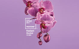
For the past fourteen years, Pantone (which dubs itself “the global authority on color”) has selected a “Color of the Year”. In December they announced Radiant Orchid (PMS 2352) as the color of the 2014 and it truly has lived up to that name. The fashion, wedding, graphic design and home improvement industries have all embraced the warm purple hue. Several retailers and publications have marketed the Radiant Orchid color family including Sephora, HGTV, Veer.com, and many more.
We’re still a couple months away from the announcement of the 2015 Color of the Year but Pantone has posted their fashion color report for spring 2015 which they’ve named “En Plein Air”. It consists of sixteen colors described as “an ethereal mix of understated brights, pale pastels and nature-like neutrals”. At trade shows the majority of exhibits use highly saturated primary colors, which can look like a fast food restaurant’s ball pit, or stark white displays that leave a lot to be desired. This collection of muted hues will be a refreshing change of pace in the upcoming year.

Pantone invests a lot of time in anticipating what next season’s hot colors will be. The color of the year is selected after five years of research but some predictions for 2015 have been made already. I’m predicting something more muted and cool toned which will follow suit with the springtime collection. Pantone has only chosen one neutral to be Color of the Year and the majority have been warmer shades. Among my favorites are indigo blue, sage green and charcoal gray – the three together would make a great combination! I also think wood tones will start making a come back at trade shows. We’ve seen a lot of white laminate in past years, which have a clean, almost clinical feel but as exhibit designers seek to make their spaces more inviting and homey, a less stark palette will be in high demand.
Color is an important component to trade show exhibit design. Graphics are the easiest thing to swap out and the most cost effective way to inject life into an exhibit. For the upcoming year make it a goal to stray away from boring and expected. Mix it up with interesting, rich and sophisticated color palettes. It is possible to remain true to your brand while using trends to your advantage.


