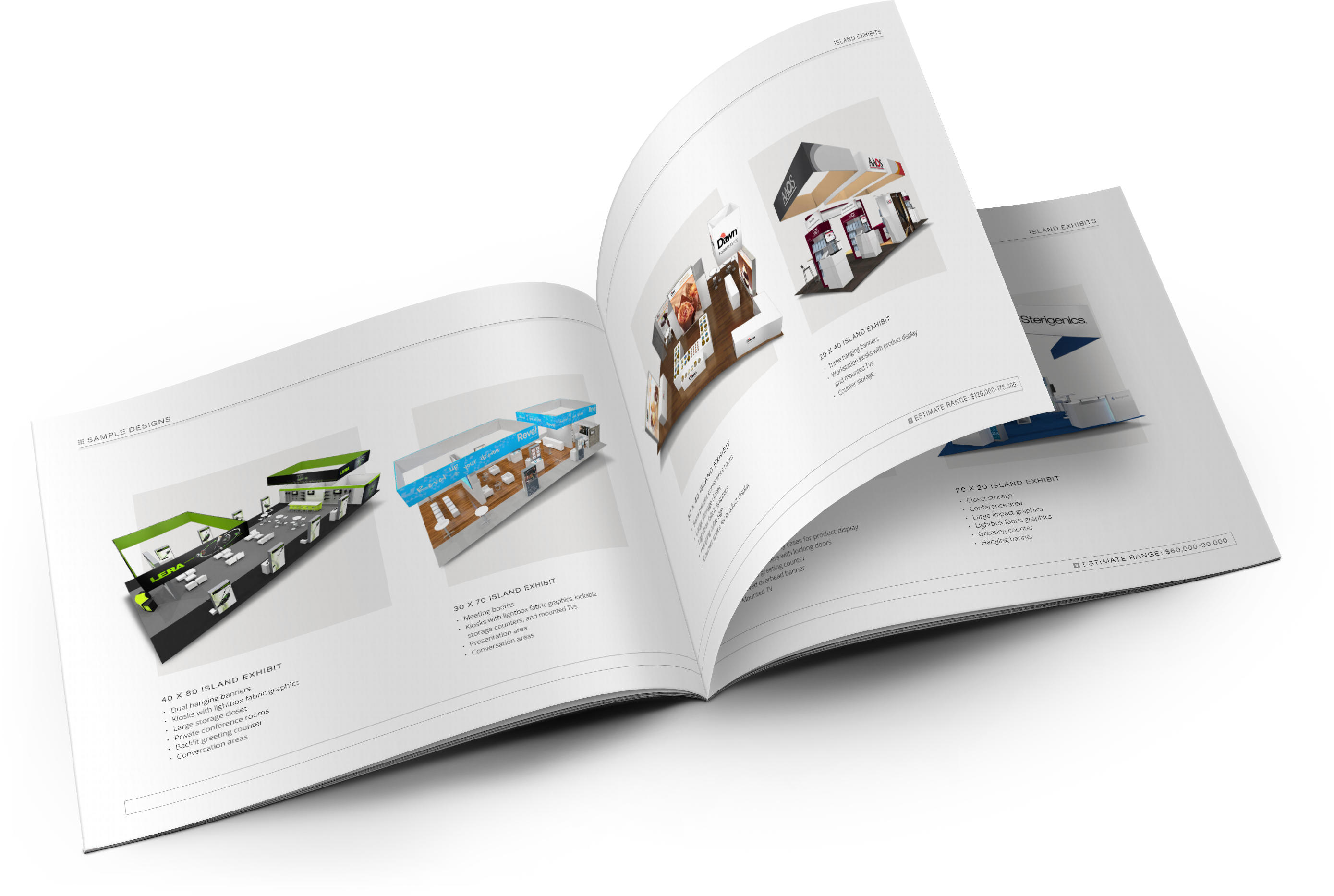
Graphic designers have the difficult task of inventing new ways to communicate a specific message. In trade show booth design there are a few things to keep a close eye on. Here are my tips for effective exhibit design:
 1. Less is More
It is tempting to fill up the large spaces of a trade show booth with information but the reality is no one will stop to read it all. The sole purpose of booth graphics is to attract attention, preferably in a positive way, so save the paragraphs of type for a brochure or other forms of collateral. Negative space or “white” space is not the enemy; breathing room is necessary to keep designs from overwhelming the viewer.
2. Be Conscious of Structure
Designers have to be conscious of where panels break and what content is jumping the seam. Be careful not to cut letters in half and impede legibility, especially if there is space between the panels. Also watch out for where images break. Cropping the human body in the wrong place can make people feel uncomfortable, believe it or not. A trick I learned in figure drawing is to never crop on a joint. The body needs joints for structure and movement so when cut off the surrounding body parts look doughy.
3. Design Appropriately
Considering the target audience is critical to designing an effective tradeshow booth. Typeface choice can make or break the graphics. Decorative fonts have their place in the world but most of them do not give a professional vibe. Go for something strong, simple and easy to read. Another thing to consider is the proportion of type and imagery. Type on a hanging sign should be larger than type on a bannerstand because it is viewed at a greater distance.
4. High Quality Graphics are Key
One of the biggest problems designers deal with is image re-sizing. Booth graphics print at 100-200 dpi (or dots per inch). Web images are set at 72 dpi because that is screen resolution and going higher is unnecessary so, more often than not, downloading images from the internet won’t work. Purchase high quality stock photography or have high quality photos taken and the result will much better.
5. Avoid an Identity Crisis
Companies like Shell and Apple have very recognizable logos that need no explanation but most companies can’t get away with that. Having an acronym or symbol logo without the full company name spelled out near by are common mistakes. Also, if the company name doesn’t describe its services there should be a tagline included that clarifies things. These mistakes cost companies credibility but they are quite simple to avoid.


