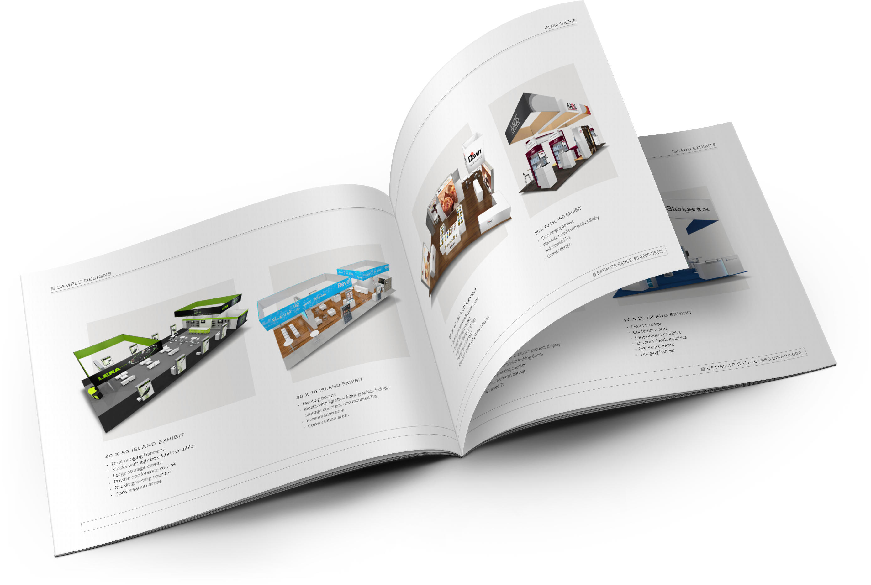
The success or failure of your booth can sometimes be linked to something as simple as graphics. Pictures and words appear everywhere from your web-site homepage to your brochure but at a show the placement of your text and graphics makes its greatest impact is in your trade show display. So…On the first day of a trade show, The Tradeshow Network gave to me… One awesome booth and twelve “days” of amazing graphics advice! Here are our twelve tips for you!

- Know Your Audience: Who is your target market? Cater to them. A lot of our clients have different graphics for different shows so that they’re not sending the wrong message to show attendees.
- Avoid an Identity Crisis: Maintain your brand throughout the booth. Your logo should be visible from all angles so that no one is wondering who you are and even if other concepts are brought into the graphics they should be consistent with your branding guidelines.
- Think Big Picture: Think about the size of your booth and the perspective of the viewer. Keep all important information at eye level or higher.
- Scale & Proportion: Trade show graphics are huge! Take advantage of the space and consider the size relationships between images and type as well as viewing distance.
- The Devil is in the Details: When working with graphics on your computer it’s easy to forget that they will be on a three dimensional booth with lots of different features. Make sure you know where exactly things like counters, literature racks, monitors and other items will be placed so they don’t obstruct any important information
- Tell a Story: Your graphics should have some kind of flow to them. There may be several different pieces but creating a flow between them is a must.
- Don’t Skimp on Quality: Use vector graphics whenever possible and either purchase high resolution stock photography or have your own taken to avoid pixilation.
- Use Color Wisely: Color can be your enemy or your friend. You want your booth to stand out but not overwhelm people. This is why it’s a good idea to keep to a specific color palette that is consistent and complimentary to your branding.
- Don’t Get Crazy With Fonts: There are some fun fonts available pretty much everywhere but just because they’re there doesn’t mean you should use ALL of them. Stick to one or two and use their variations to add interest. Use different weights and sizes to create a consistent hierarchy.
- Keep it Modern: It’s the 21st century and trends are ever changing, graphic design is certainly not exempt from that fact. A contemporary look will up your credibility and draw positive attention from attendees. But try not to be so trendy that you have to constantly purchase new graphics to keep up.
- Less is More: I cannot stress this enough! Don’t try to fit 20lbs of information in the proverbial 10lb bag. No one will stand there and read paragraphs of information. Save that for brochures and other collateral.
- Hire a Professional: If anything listed above is out of your knowledge base then it’s best to leave it to a graphic designer who is familiar with large format graphics output. There is a learning curve so try to find someone with trade show experience.
Need assistance with your trade show graphics? Let us know. Share your tips for AMAZING trade show graphics in our comments section.
Comments


