If you've ever been part of a company or worked on a product that's undergone a rebrand, you know how absolutely crazy it can be. From establishing goals, to iterating on designs, to actually implementing your branding changes on your website and across all of your marketing channels, it’s a lot of work.
I was part of a rebrand at a startup a few years back. The company at the time was shifting direction and targeting a different audience, so a rebrand made sense. We had to come up with a new name, new logo, new colors … new everything!
Needless to say, there were a lot of brainstorms, a lot of late nights, and a lot of general craziness right up until we flipped the switch on the new branding.
If you are thinking about rebranding a company, product, service, etc., you’ll be walking down a road that many businesses have walked down before. To help you stay on track, I’ve put together four lessons from four famous rebrands. Some of them were successful. Others, not so much.
Let’s dive in!
1) Don’t mess with a sure thing.
And by “sure thing,” I mean a brand identity that can be easily recognized and recalled by millions (if not billions).
For clothing retailer the Gap, this identity was -- and continues to be -- inexorably linked to a dark blue square with three capital letters inside.
But in October of 2010, the powers that be at Gap decided to “modernize” the brand. The new logo they unveiled kept the iconic blue square, which had been part of Gap’s brand identity since 1986, but they made it tiny and put it behind the “p”.
The other notable difference was the text. The original logo used a tall, narrow font. All caps. Meanwhile, the new logo used a bolder font, and only capitalized the “G”. Now, I’m sure the folks at Gap had the best intentions when they executed this rebrand. But the end result was, unfortunately, ill received.
In a contemporary article about the rebrand, Author/writer Abe Sauer noted that the new logo looked "like it cost $17 from an old Microsoft Word clipart gallery."
Yikes.
The article also points out how Gap didn’t really announce the rebrand. No press release. No, “Hey, check out our new look!"
One morning, the new logo was just up on their homepage.
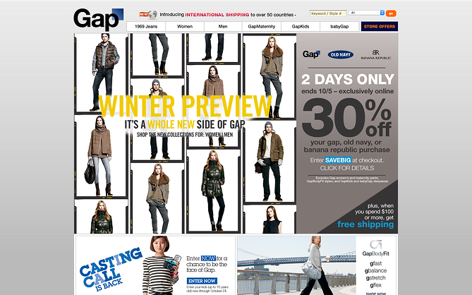
And then, a week after the new logo appeared, *poof* -- it was gone. Like a vaporous specter disappearing into the mists of a haunted graveyard. Or like a penny disappearing into the front pocket of a pair of skinny jeans.
The president of the Gap even apologized for the whole debacle, noting, "We are clear that we did not go about this in the right way. We recognize that we missed the opportunity to engage with the online community.”
It was the online community, after all, that publicly bemoaned the new logo, ultimately causing Gap to switch back. (Mashable has a nice write-up on the social media backlash here.)
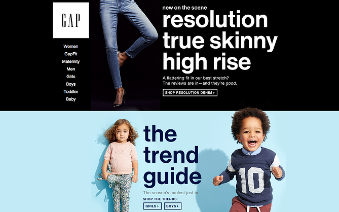
Today, I’d say Gap’s branding is back on track. They’re finding new ways to modernize the logo without it changing it completely. On their current homepage, for example, they use transparent lettering in the logo so background images can show through.
2) K.I.S.S.
The Starbucks rebrand of 2011 was so subtle and -- arguably -- so well executed, that you probably didn’t even notice it.
On the logo front, the big change was removing the big green ring, which also meant ditching the “Starbucks Coffee” text and the star icons. Of course, Starbucks kept their iconic green, using it as the new background color for the siren figure. (FYI, that’s who that lady is supposed to be -- a siren.)
![]()
According to Starbucks CEO Howard Schultz, "The goal was not only to refresh the mark but to free the Siren from the ring, allowing her to be treated more artistically.”
The 2011 rebrand also included a new, responsive website design.
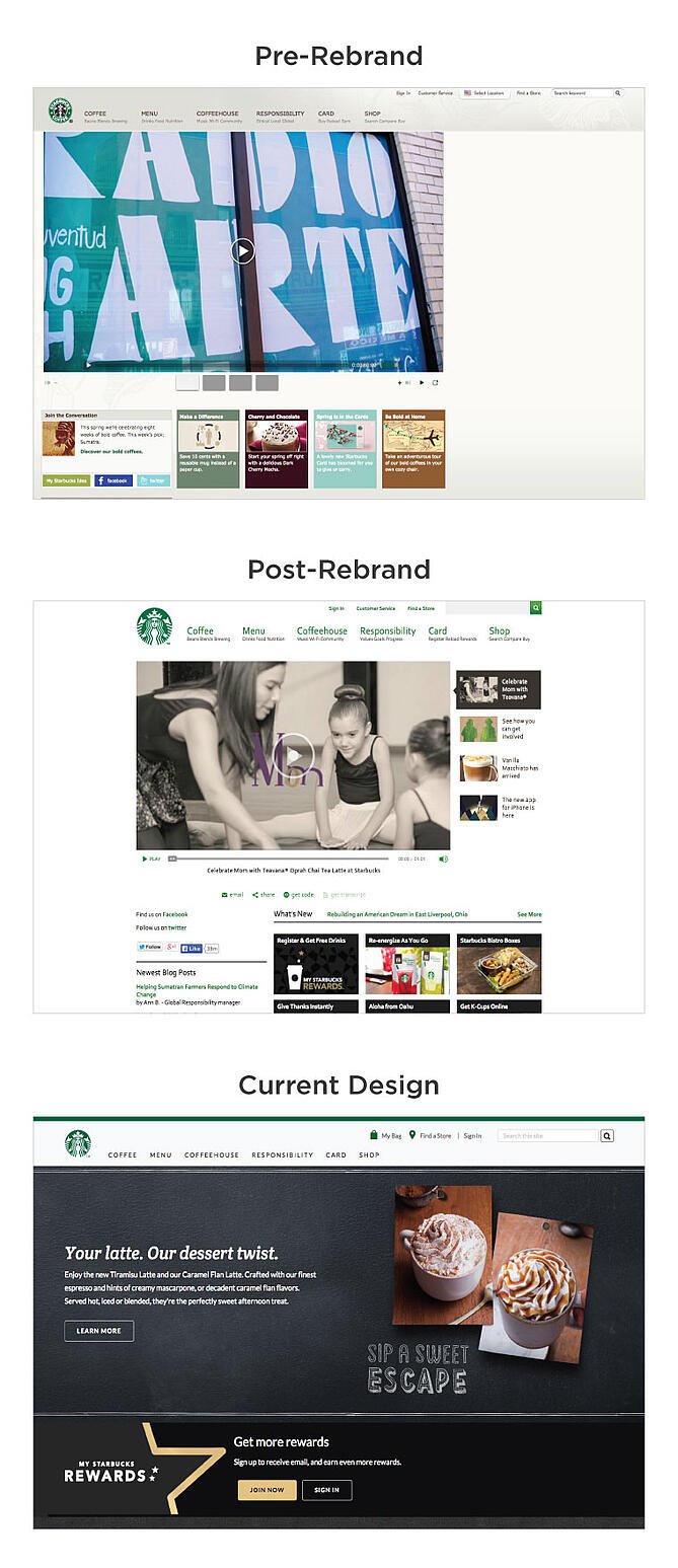
When it was all said and done, the Starbucks rebrand didn’t damage or dilute the Starbucks brand. There was no public outcry or social media backlash.
Why not?
Starbucks kept it simple. They didn’t try to reinvent the wheel with their rebrand. Instead, they took what they already had and found a way to refresh it.
With the new logo, Starbucks kept their brand colors and key iconography (the siren) in tact, and simply stripped away the superfluous information and design elements (i.e., the text and the stars). Ultimately, they made the logo much simpler.
3) Make your mark.
While it’s not a well-known name in the U.S., Vodafone is the third-largest mobile telecommunications company in the world. (For comparison, Verizon Wireless and AT&T -- the two largest mobile providers in the U.S. -- only clock in at numbers 19 and 20 on that list, respectively.)
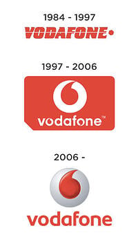 The London-based telecom giant is no stranger to rebrands. In 1997, they completely reimagined their logo, scrapping everything from the previous version with the exception of the color.
Vodafone’s new logo took the shape of a SIM card, and introduced the single quote or “speech mark” as their signature icon. They even managed to incorporate the new icon -- twice -- into the Vodafone text. (They’re “hidden” inside of the two o’s.)
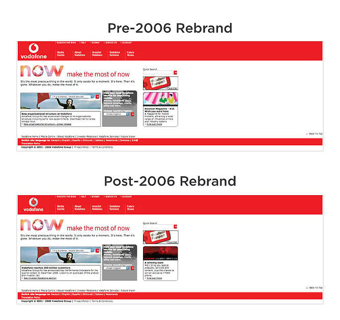
In 2006, Vodafone rebranded once more, eliminating the SIM card background and the in-text icons from their previous logo. The speech mark also got a design makeover, with some gradient work added to make it feel a little more dimensional.
From a web design perspective, however, the 2006 rebrand didn’t mean much. Initially, Vodafone simply swapped in the new logo for the old one.
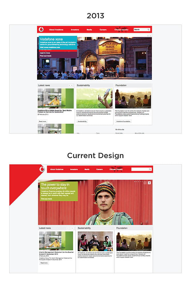
In 2013, Vodafone underwent a “soft’ rebrand, eliminating the text from its logo and using the stylized speech mark as its primary mark. This was also accompanied by a website redesign, which gave Vodafone’s site a much more modern feel.
Today, the site’s design is only slightly different from that 2013 design, the main difference being that there’s now a big red shape protruding from Vodafone’s logo (see below).
When we look back at the evolution of Vodafone’s brand, we can see what they were striving for: a single mark that could represent them.
In 2006, they made progress in that direction by 1) eliminating the SIM card element of their logo design, and 2) simplifying the text in their name. In 2013, they were ready to ditch their name from their logo entirely, and they now let their iconic speech mark do all the talking.
4) Don’t leave room for interpretation.
![]() Let me clarify that: Don’t leave too much room for interpretation. Abstract logos, after all, can be cool and -- more importantly -- they can be effective at representing your brand. (Just think about Nike’s swoosh, one of the most recognizable logos in the world. I mean, what the heck is a “swoosh”? They made it up.)
Let me clarify that: Don’t leave too much room for interpretation. Abstract logos, after all, can be cool and -- more importantly -- they can be effective at representing your brand. (Just think about Nike’s swoosh, one of the most recognizable logos in the world. I mean, what the heck is a “swoosh”? They made it up.)
Now, on to the example at hand: Airbnb.
In 2014, Airbnb unveiled a new logo, which included a new mark that they dubbed the “Bélo."
The Bélo, according to Airbnb, stands for four different things: people, places, love, and the letter “A.” They even created a video to show you how those four elements combine to form the Bélo.
![]()
Unfortunately, at the time of the rebrand, the general public wasn’t really interested in how the Bélo was conceived; they were more interested in what it looked like. And many people though it looked kinda inappropriate. Some folks also found a resemblance between Airbnb’s new branding and some pop culture icons (including E.T. and Family Guy’s Peter Griffin).

Now, if you’re of the opinion that “all press is good press,” then Airbnb completely, totally, unequivocally nailed their rebrand. They got a TON of press out of the situation, and heck, I’m even writing about it now, a year later.
Even so, there’s a valuable lesson to be learned here: When creating or updating your logo, make sure you’re aware of how it could be interpreted.
It’s easy to get “lost” in a design, and to see what you want to see. Getting a fresh perspective -- from someone who hasn’t been working directly on the rebrand -- can help ensure that potentially offensive/silly/disturbing elements don’t accidentally make their way into your logo design.
So there you have it! Four rebranding tips from four actual rebrands. Have any other tips you’d like to share? Sound off in the comments section below.
Guest Blogger: This article was reposted from Erik Devaney@bardofboston from the lastest HUBSPOT blog post. You can view the entire article here.


