The majority of booth designs are monochromatic with either black or white components - for good reason. It’s a classic look and when you’re renting from a show or an exhibit house you have to work with what they have in stock. Keeping the color scheme simple can also be a good strategy for attracting attendees to your booth. It’s true that less is more, a booth space shouldn’t feel crowded, it should be open and inviting and every component should serve a purpose.
All that said, sometimes plain can be boring and introducing some color is a great way to liven things up. Here are 6 booth designs that we think do color well:
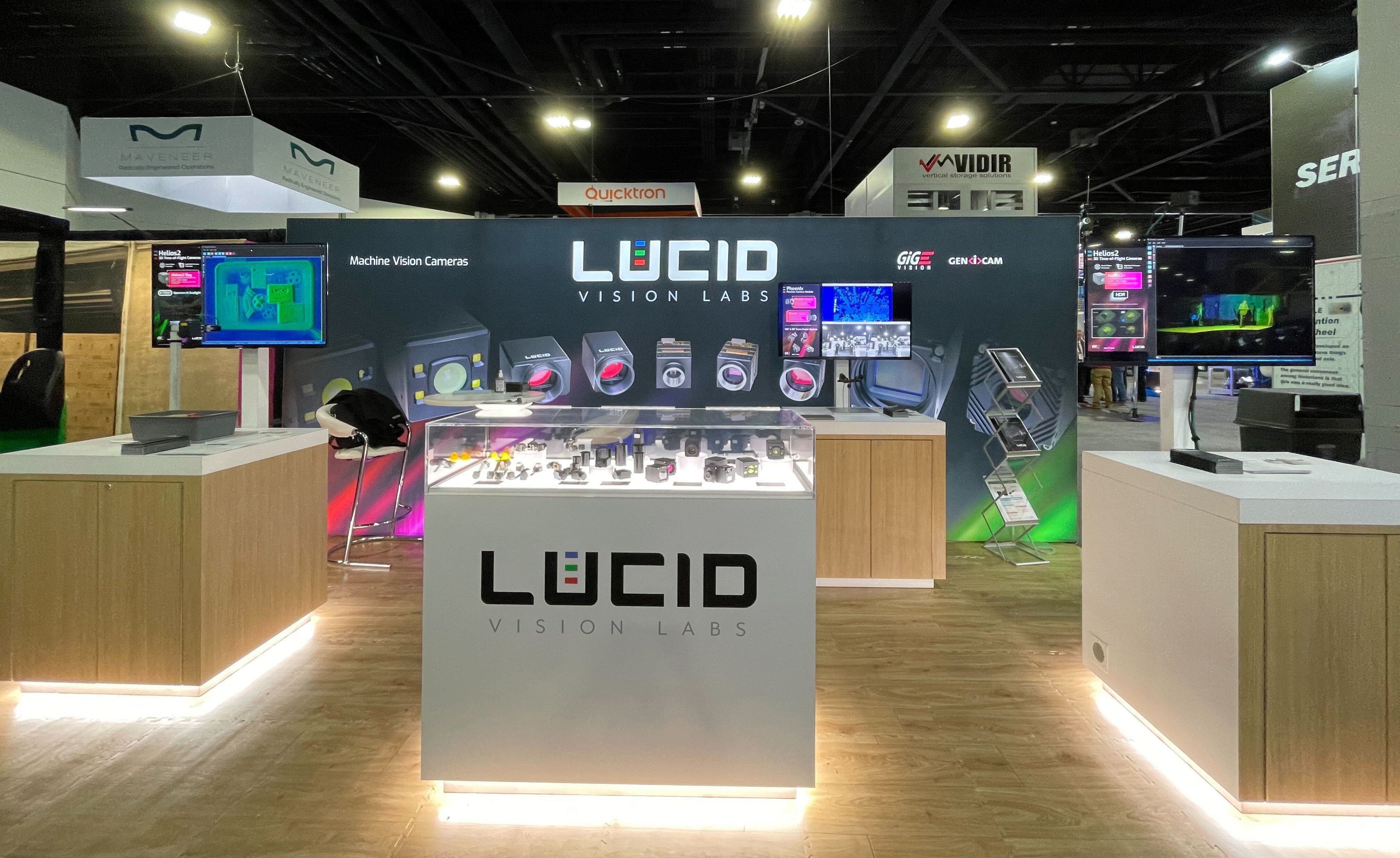
- Why it works: The color scheme in this booth is pretty simple. The red is loud and grabs attention but the product photos is where all the action lies. Mixed with grey and white, the colors don’t become overwhelming or busy.
- Why it works: Lots of colors in a booth can look a little unsophisticated but this booth pulls it off well. You can unite 4-5 different hues by keeping them within the same value range (the relative darkness or lightness of a color) and by selecting one or two as the main colors while using the rest as accents. This booth does a good job of breaking up the color with using photography on white backgrounds as well.
- Why it works: This booth is simple in design and color scheme. Purple isn’t a color you see very often at trade shows and the pop of green really sets it off. Using complimentary colors can be a great place to start if you’re looking to add some interest to a design.
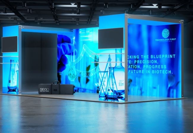
- Why it works: Here’s another example of how to use complimentary colors well. The blue and orange really contrast each other well. Sometimes complimentary colors can look like sports branding (think Chicago Bears, or LA Lakers) but this booth adds a little yellow to both the blue and the orange which ties them together much better.
- Why it works: This booth really takes branding into account. While it still has a monochromatic color scheme, it isn’t at all lacking in color. The bright orange is well used as opposed to an abundance of white. The “M” shape of the booth and transparencies in the form of frosted plexi adds a lot of interest as well.
- Why it works: Rather than the normal white or black laminate structure, this booth uses green which will automatically set it apart from other booths at the show. The graphics themselves are quite plain and simple. Changing the color of the structure isn’t always an option unless you go with custom pieces. Discuss those ideas with your exhibit provider. They may have solutions for you that you haven’t thought of before.